WELCOME TO MY PORTFOLIO

Neptune Morales
20+ years Multidisciplinary Designer and a Problem Solver


PORTFOLIO


SERVICES
Graphic Design Service
Logo & Branding Design / Packaging Design with 3D Rendering / Brochure & Flyer Design Menu & Menuboard Design / EGD (Environmental Graphic Development) / 3D Modeling Design with 3D Rendering / Kiosk, Product Display, Event Booth Design with 3D rendering Cartoon Character Design / Image subject cropping / Tracing raster graphic to vector graphic
Website Design Service
Multiple Page / One Page Website Design
Using:
WordPress with DIVI theme plugin website builder / WIX.com website builder / Carrd.co website builder
Tracing & Cropping Service


PROFILE

MABUHAY!
I’m Neptune Morales, a Brand Specialist and Design Consultant based in the Philippines with over 20 years of mastery in logo design and visual identity. I don't just create graphics; I build assets that take companies from striving to arriving.With a diverse toolkit spanning 2D/3D design (Illustrator, 3ds Max) and strategic web builds (WordPress, Divi), I ensure your brand doesn't just fit in—it stands out. If you’re looking for a seasoned partner to elevate your business, I’m ready to help you lead the market.


Design Privilege is more than a portfolio; it is a standard of excellence. I offer a full spectrum of design—from Branding and Packaging to 3D Rendering and Murals—giving your business the competitive edge it needs to lead the market.My identity is built on versatility. The wing graphic represents the fusion of print (CMYK) and digital (RGB) expertise, proving that "Design Privilege" can handle any challenge.My philosophy is simple: "Flying with colors." I am a meticulous perfectionist who is passionate about the craft. To me, providing high-level service and helping your business stand out is not just a job—it’s a privilege.


MISSION
My mission is to use my God-given talent, and skills in designing to help entrepreneurs with their concerns about branding, and graphics needs. To help them boost their business and help their products to sell well in the market world. As they continue to grow and convey more trust towards their potential patronizer.

VISION
My vision is to be a leading branding and graphic designer here in the online world business. To bring back the lost art of designing that contributes to making a business successful. To show what’s the true standard of designing that works, and to inspire other designers like me and do well with their craft.


MESSAGE


TRACING
CROPPINGS


TESTIMONY


PAGE 1


TESTIMONY


PAGE 2


TESTIMONY


PAGE 3


TESTIMONY


PAGE 4


TESTIMONY


PAGE 5


TESTIMONY


PAGE 6


TESTIMONY


PAGE 7


LOGO DESIGN


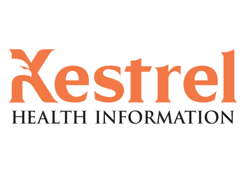
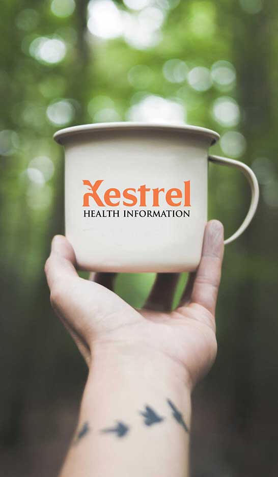
I refreshed a 20-year-old medical review brand by replacing its legacy script logo with a bold, modern identity featuring a Kestrel silhouette. This clean and professional design fuses the falcon’s precision with a contemporary corporate aesthetic, creating a high-integrity mark built to last another two decades.
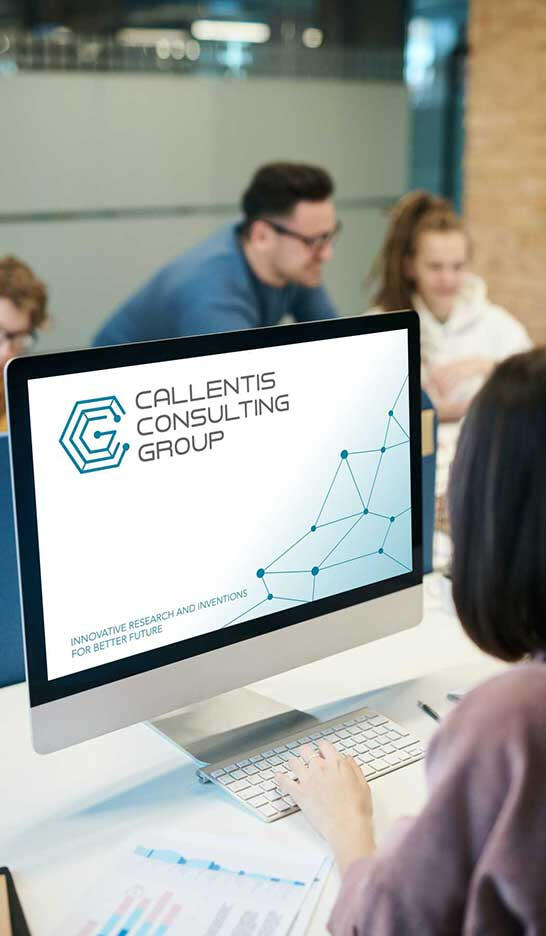
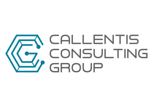
I designed a corporate identity for Callentis Consulting Group by fusing the letters "C, C, and G" into a molecular graphic. This interconnected symbol mirrors their leadership in medical and energy research, creating a brand that is as precise and innovative as their scientific work.


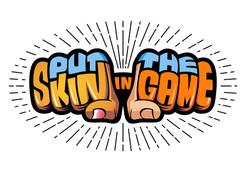
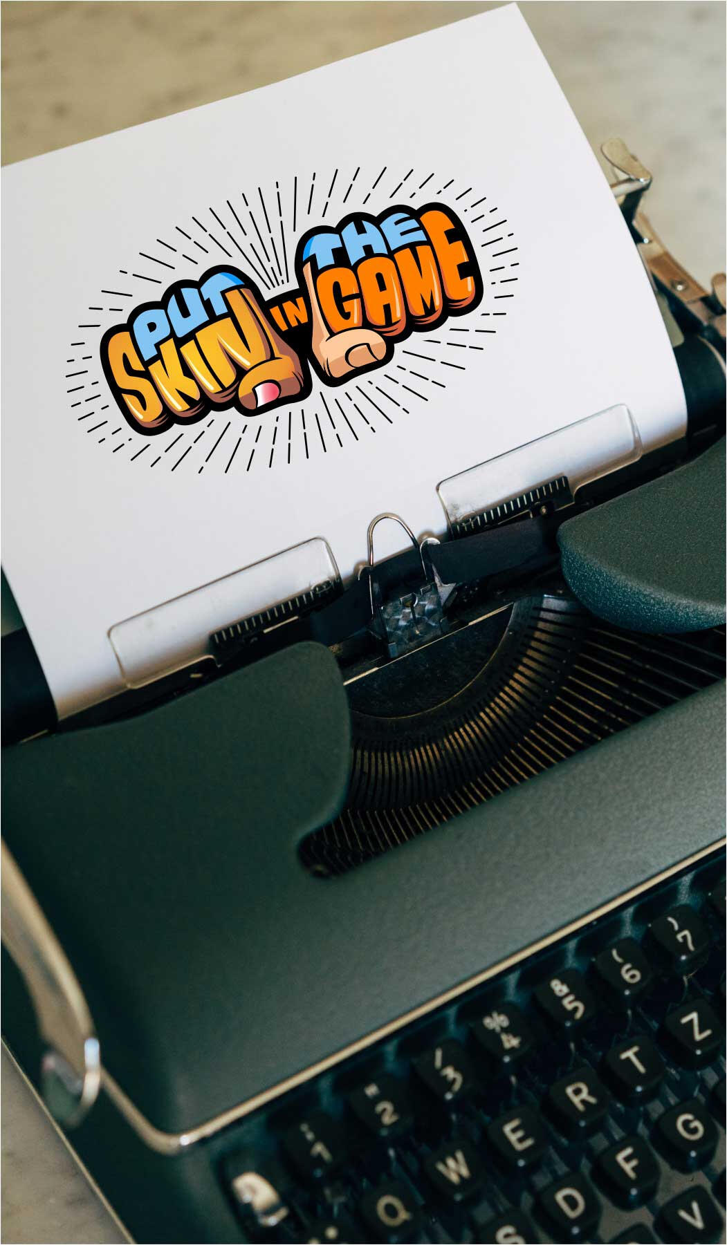
The "Put Skin in the Game" identity features a knuckled hand with integrated typography to symbolize deep commitment and team motivation. Its vibrant color palette celebrates diversity and inclusion, representing a multicultural workforce united by excellence, creativity, and a shared goal.


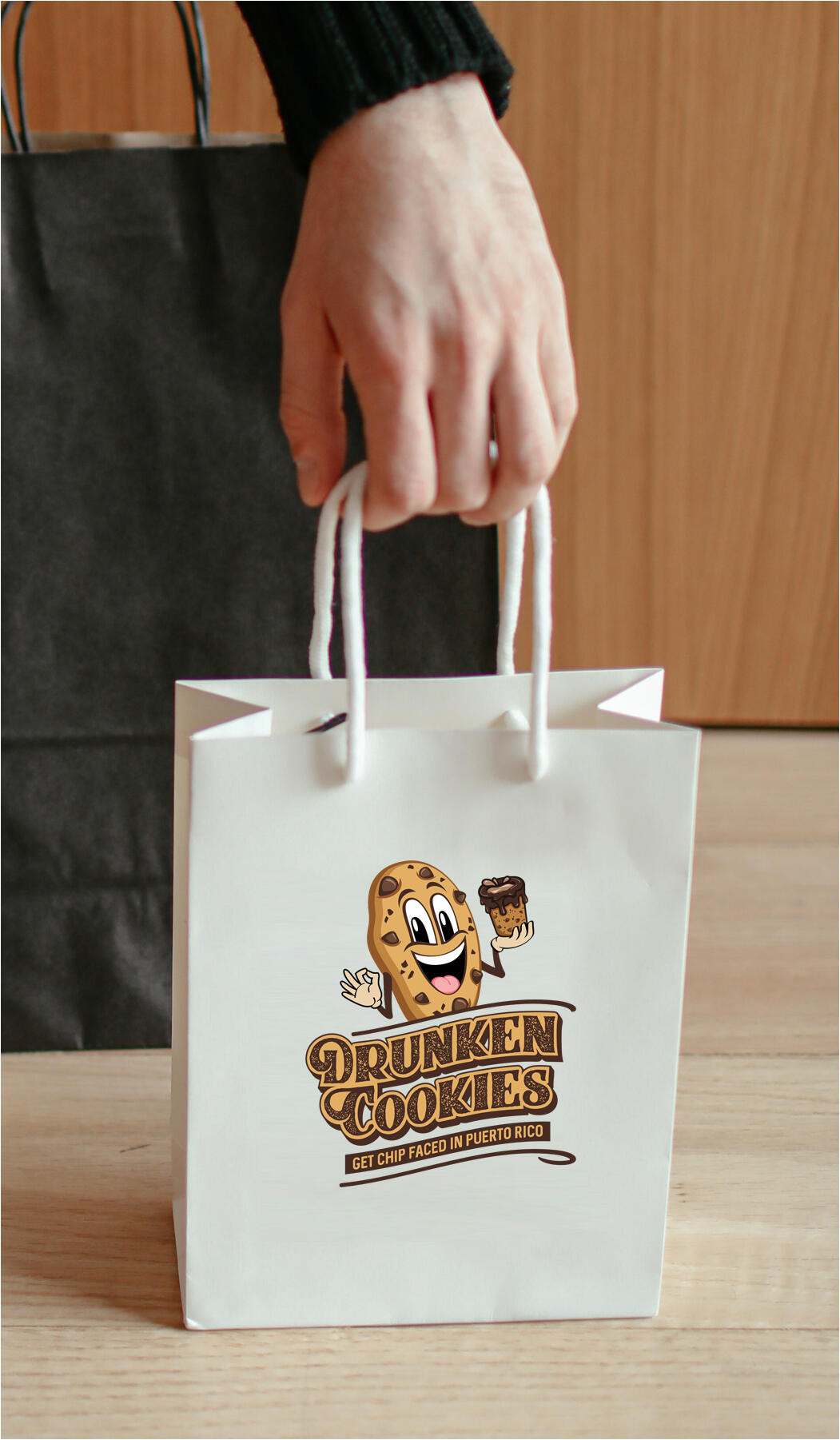
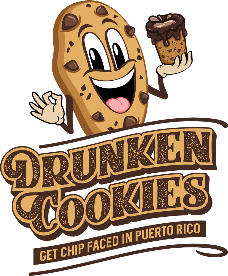
Drunken Cookies blends Puerto Rican tradition with Bay Area flair, using a bold and playful identity to drive foot traffic in high-volume tourist ports. From Coquito-inspired treats to a vibrant storefront presence, the branding creates an enticing atmosphere that sparks curiosity and invites customers to stay a while.


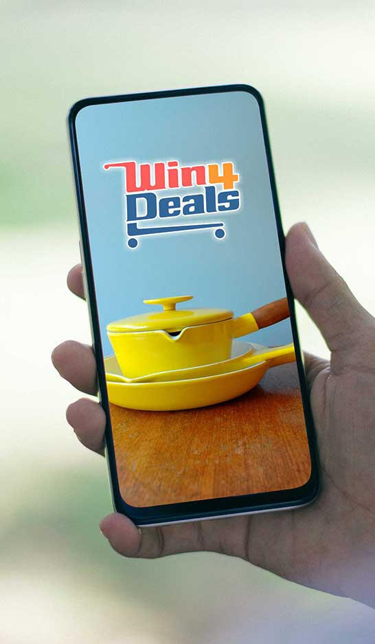
I designed a high-end e-commerce identity for Win 4 Deals by customizing the typography to seamlessly form the shape of a shopping trolley. This literal representation of the retail experience creates a distinct, recognizable mark designed to capture attention on Amazon and convert casual browsers into loyal customers.


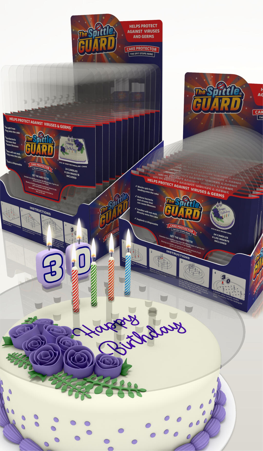
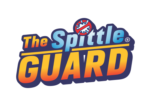
Spittle Guard is a hygienic brand identity featuring a "Stop" sign integrated with a splatter graphic to symbolize its mission of total protection. Representing a high-grade, transparent cake canopy that allows for safe candle-blowing, the logo is a bold, functional mark for a revolutionary household essential.


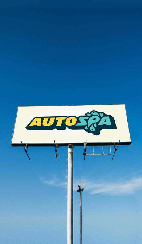
Auto Spa: Clean, bold, and recognizable. To capture the energy of the automotive world, I used a sporty, high-weight font and integrated a water drop swirl to anchor the brand's identity. It’s a professional look designed to stand out to every driver on the road.


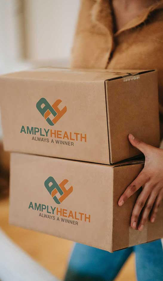
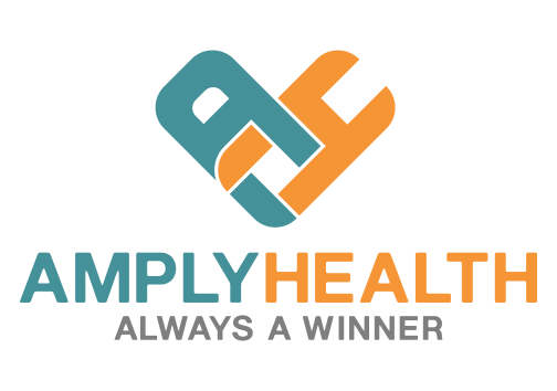
Amply provides accessible, high-quality PPE through a brand identity that fuses its initials into a heart-shaped icon. This creative symbol reinforces the company’s mission as a healthcare provider, building an immediate bond of trust while representing a commitment to safety and abundant care.


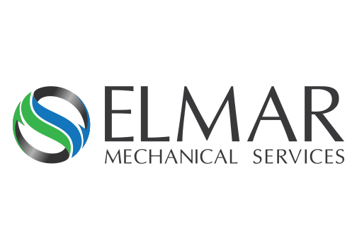
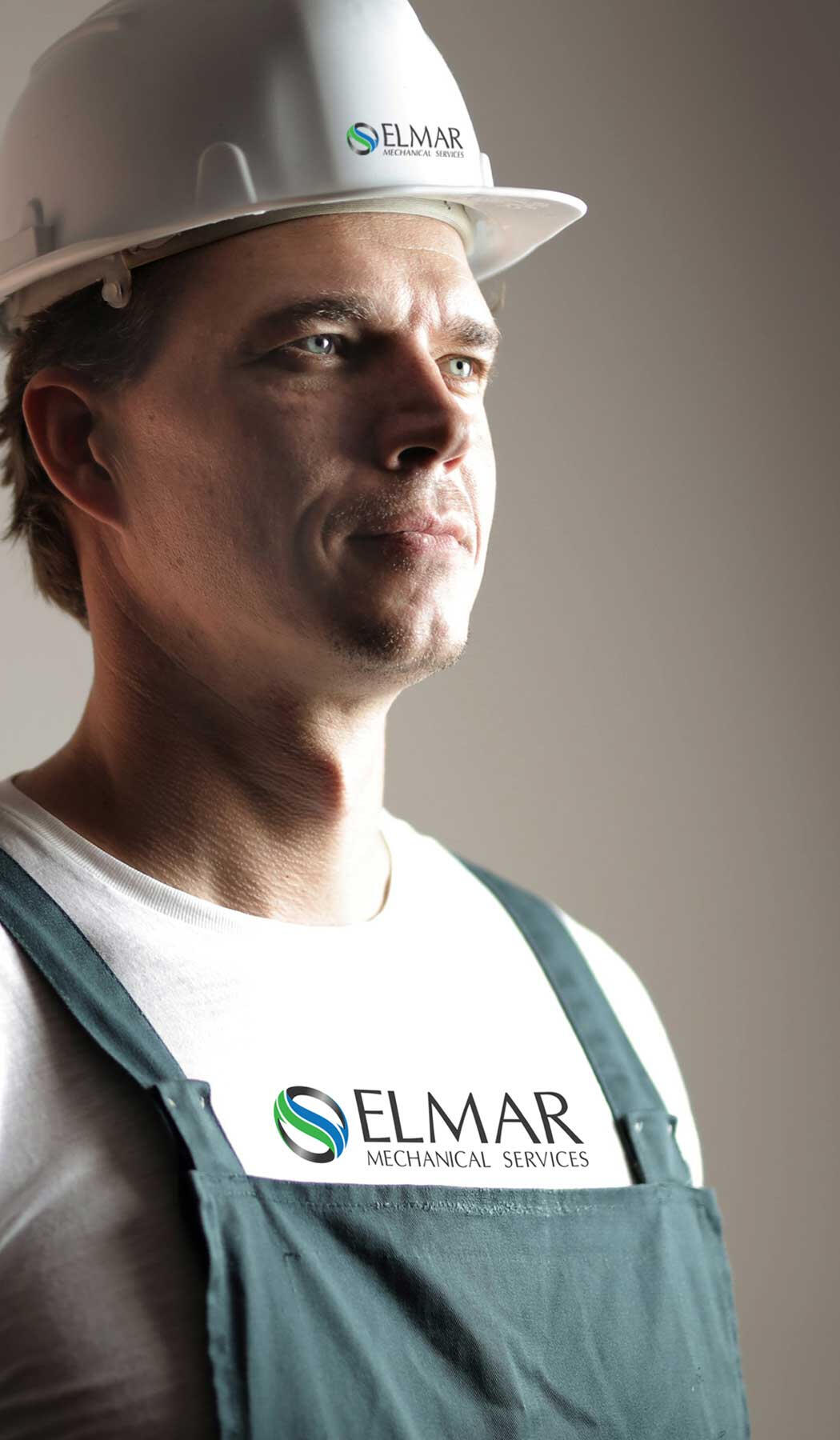
I modernized the Elmar brand by transitioning its legacy aircon installation logo into a bold, high-integrity identity. By retaining the original color palette, the refresh maintains brand recognition while highlighting their expertise in eco-friendly cooling, positioning Elmar as a clean, professional leader in modern HVAC services.


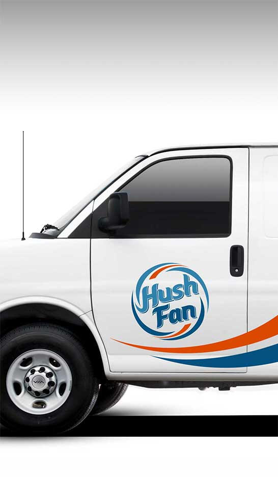

Hush Fan combines silence with performance through a custom identity designed to embody "quiet and calm" cooling. The logo features a blue wind graphic to illustrate fresh airflow, contrasted by a red accent representing heat dissipation, creating a reliable and "cool" brand that communicates efficiency at a glance.


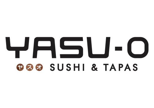
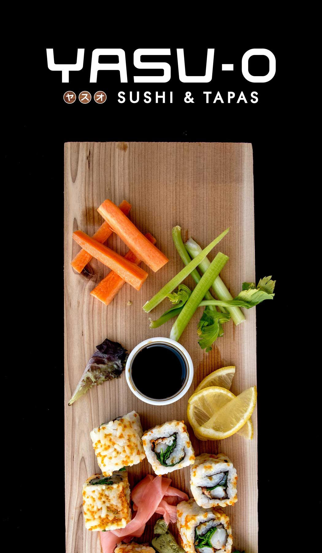
YASU-O, meaning "Peaceful One," is a Japanese-style brand designed to evoke a calm, inviting atmosphere. The name features a strategic dash to ensure correct three-syllable pronunciation, while the customized, modern typography reflects a "peaceful" environment perfect for enjoying authentic bite-sized cuisine.


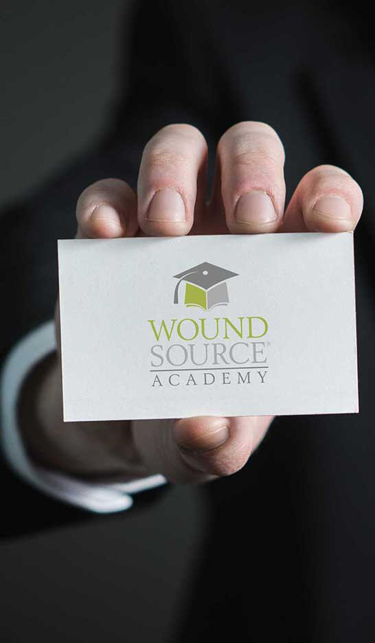
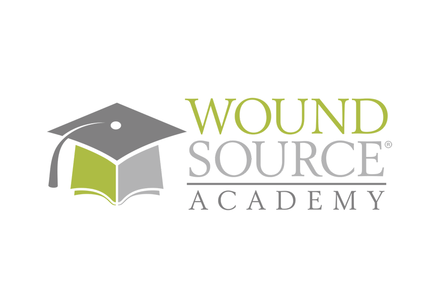
To expand Wound Source Academy into the educational space, I developed a sub-brand that retains the core identity while clearly signaling its role as a learning platform. The design features a graduation cap integrated with a book symbol to represent both the foundation of knowledge and the certification students achieve, resulting in a professional and informative mark.


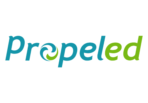
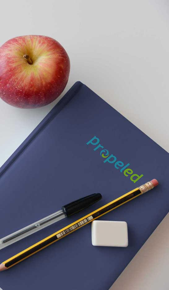
I developed a high-integrity brand identity for a European web platform, focusing on establishing immediate trust and credibility. The design features a stylized propeller—symbolizing momentum and reliability—integrated into a clean, modern mark that perfectly positions the brand for the international market.


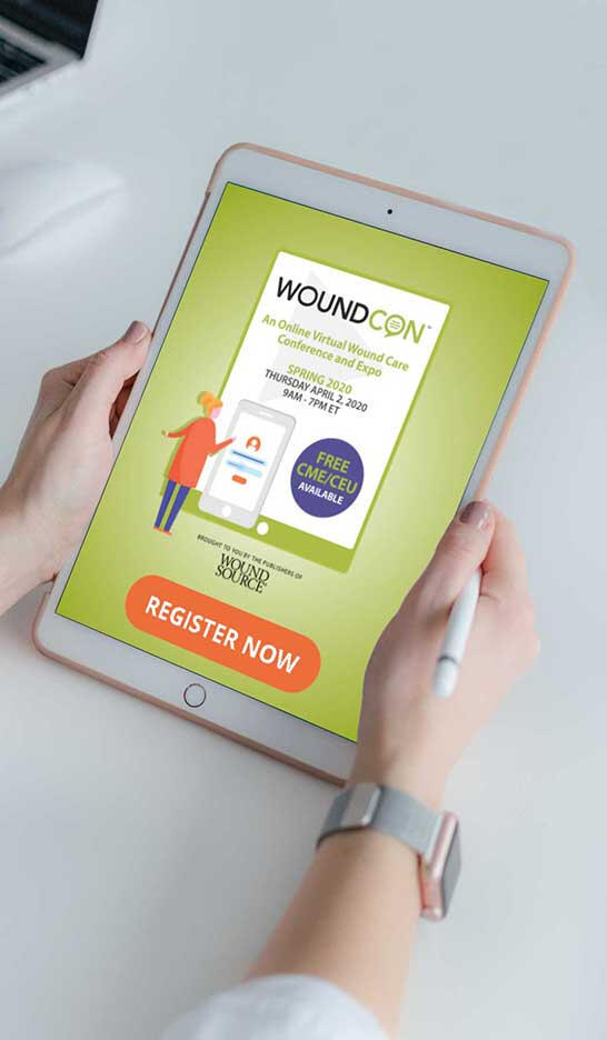

The Woundcon logo is a clean, authentic design tailored for an online conference to ensure immediate clarity. By integrating a callout symbol into the word "CON," the mark visually emphasizes the event's focus on speakers and open discussion, creating a straightforward identity that signifies leadership in dialogue.


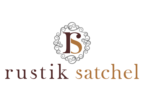
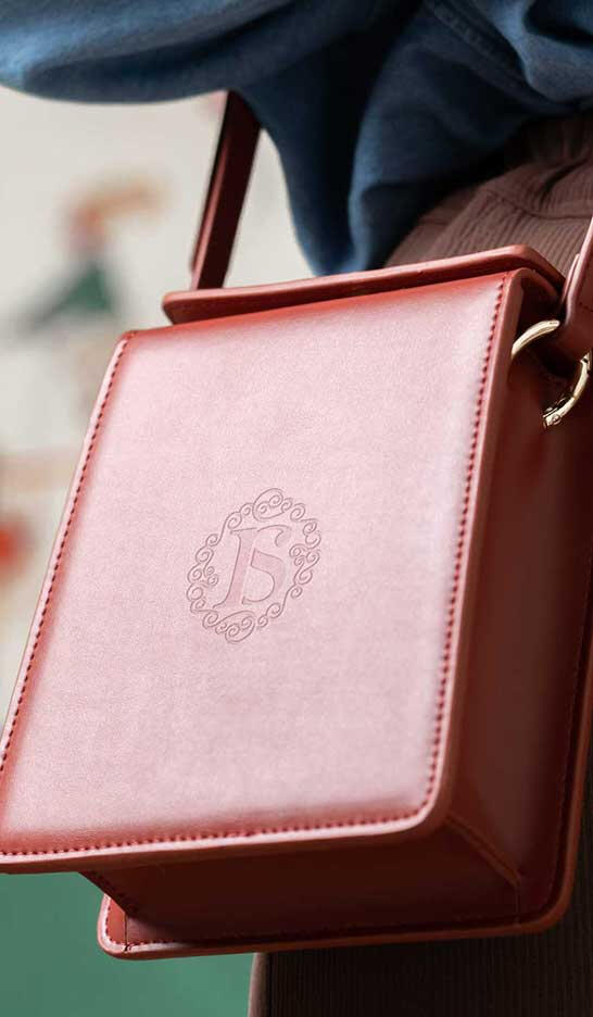
I created a custom identity for Rustik Satchel by fusing the initials "R" and "S" into a graceful monogram with spiral decorative elements. The design balances a "country-chic" vibe with a classy, feminine aesthetic, blending modern fashion and timeless tradition to perfectly represent this boutique leather goods brand.


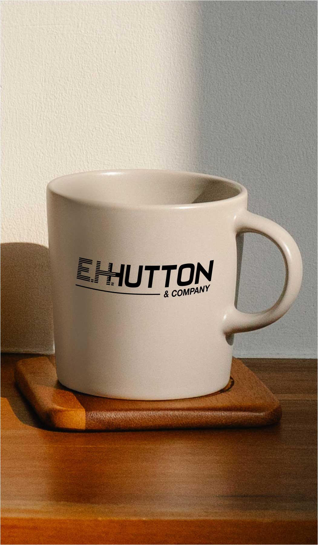

The E.H. Hutton corporate identity establishes a professional, multi-generational legacy for a diverse family business. By blending a stripline "E" and "H" with a solid, italicized font for "Hutton," the design communicates both stability and forward motion, reflecting the family’s commitment to innovation and progress.


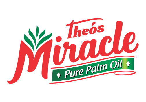
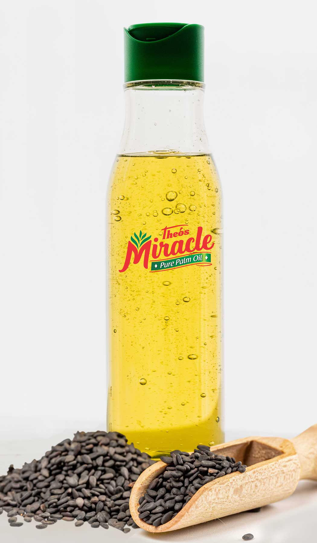
Theos Miracle is a premium palm oil brand that blends purity with tradition through a custom organic script and a palm leaf symbol. Engineered for high retail visibility, the identity uses a high-energy red palette to emphasize its "100% pure" promise, creating a bold and trustworthy presence in the kitchen condiments category


PACKAGING DESIGN


PRINT WORKS DESIGN


3D WORKS DESIGN


3D MODELING WORKS


3D EGD DESIGN


MENUBOARD DESIGN


MURAL DESIGN


CARTOON DESIGN


